ImmigrantVisaNumber2014 = data.frame(
Category = factor(c("F1", "F2A", "F2B", "F3" ,"F4", "E1", "E2", "E3", "E4", "E5", "DV"), levels = c("F1", "F2A", "F2B","F3", "F4", "E1", "E2", "E3", "E4", "E5", "DV")),
Visa_Issuances_At_Offices_Abroad = c(21511, 80041, 15137, 21931, 59140, 1680, 1880, 7088, 1489, 922, 51018),
USCIS_Adjustments = c(2480, 9451, 2382, 2100, 7020, 38928, 47191, 35611, 6798, 1464 , 1324)
)
Re-Design
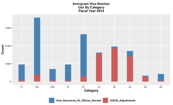
I want to make a bad graph better using what I know. I aim to create a perfect and easily understandable graph. Additionally, I plan to visualize the data in various graphs to check if any new information emerges beyond my current understanding.
The SAS website gave me the original data for “Immigrant Visa Number Use by Category Fiscal Year 2014:
.png)
Fig1: 2024 Immigration Visa Data Table
I’m making a data frame called “ImmigrantVisaNumber2014” and adding columns named “Category,” “Visa Issuances at Offices Abroad,” and “USCIS Adjustments”, I’m putting in the data from Fig1 into these columns.
Re-Design 1: Bar Plot with GGplot2
- Implemented the GGplot2 library to re-imagine the visualization, showcasing a bar plot utilizing the given data values.
The initial graph used a 3D model, which can sometimes be confusing and make it challenging for viewers to understand the data. The redesigned graph, now in a simpler 2D format, is clearer and more user-friendly..
I made a change in the Redesign1 by using Plotly library and Position = ‘dodge’ and width of the bars are 0.7 to compare ‘Visa Issuances at Offices Abroad’ and ‘USCIS Adjustments’ more effectively. In the initial design, I found a bit of difficulty in understanding the bar representing ‘Visa Issuances at Offices Abroad,’ so I placed both bars side by side to enhance clarity and better comprehend the comparison
. After redesigning the graph with Plotly, I’ve made it more user-friendly and easy to understand for everyone.
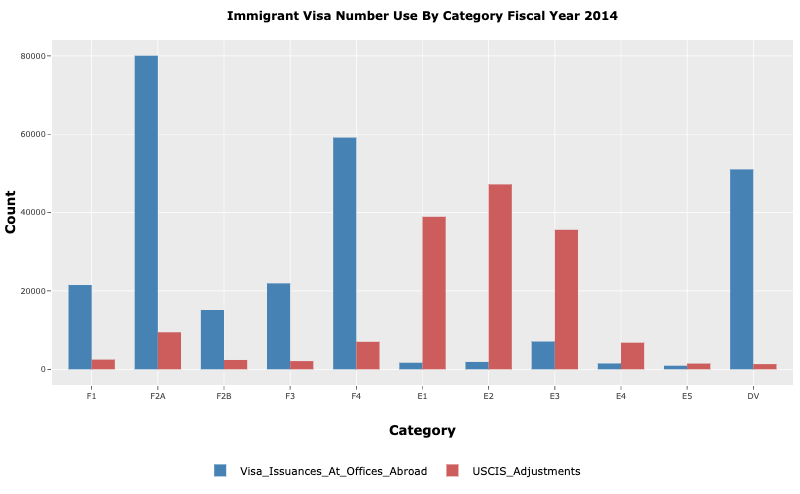
Fig3: Redesigned Graph (using Plotly)
Why i used Bar Plot:
Visual Comparison: Bar graphs facilitate easy comparison between categories.
Enhanced Clarity: Adjusting bar width and using a dodge position improves visual distinction.
Improved Comprehension: Side-by-side bars clarify the comparison between “Visa Issuances at Offices Abroad” and “USCIS Adjustments.”
Re-Design 2: Line Plot with GGplot2
I’m examining the visa trends for the year 2024, specifically focusing on the counts for ‘Visa Issuances at Offices Abroad’ and ‘USCIS Adjustments.’ By analyzing these columns individually, I aim to gain insights into the distribution and trends of visas issued in each category for the specified year.
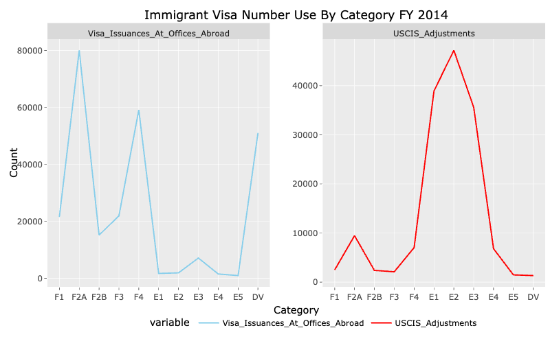
Fig4: Redesigned Graph (using Plotly)
Why i used line graph :
Trend Analysis: Line graphs are used to understand trends over time or categories.
Data Range: Effective for displaying wide-ranging values in the graph
Comparative Analysis: Separate graphs enable direct comparison between “Visa Issuances at Offices Abroad” and “USCIS Adjustments.”
Re-Design 3: Bubble Plot
Fig4: Redesigned Graph (using Plotly)
why i used Bubble Plot:
Visualizing Relationships: Bubble plots efficiently illustrate the correlation between variables, aiding in understanding the data’s interconnections.
Assessing Magnitude: Bubble size directly represents the strength of the relationship, providing a clear indication of its significance within the data set.
Spotting Outlines: Notable data points are easily spotted through the presence of larger bubbles, enabling swift identification of outlines in the data set.